Nature publishes flat-earth research paper
I usually keep my mouth shut in the face of the many hilarious errors that crop up in the burgeoning world of datasets for cultural analytics, but this one is too good to pass up. Nature has just published a dataset description paper that appears to devote several paragraphs to describing “center of population” calculations made on the basis of a flat earth.
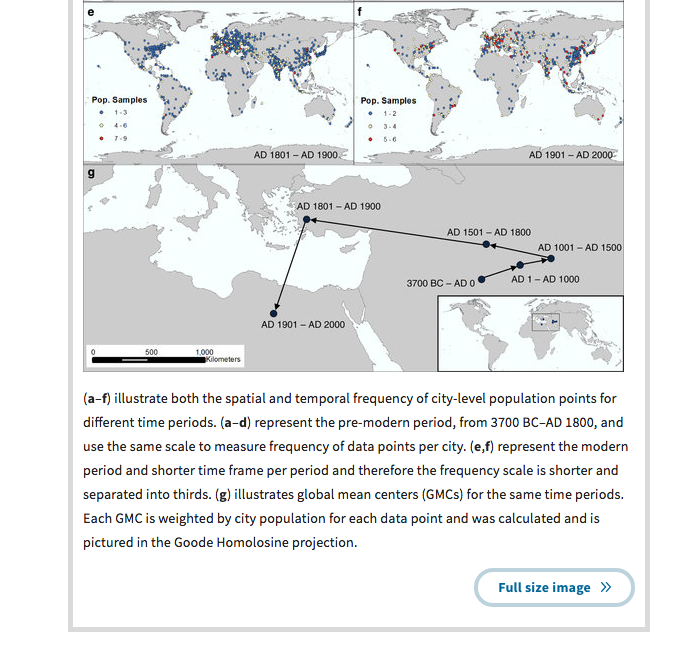
“Spatializing 6,000 years of global urbanization from 3700 BC to AD 2000” by Reba et al presents what seems like a fairly useful digitization of two books that give fairly speculative historical estimates of city populations. But as part of the writeup, it includes the following chart calculating “Global mean centers” of population as they have shifted through history: starting somewhere near Baghdad in 1000 BCE, to heading northwest for the next 2500 years, pushing west almost to Izmir by 1900, and then veering sharply south in the 20th century into the Sahara.
“Center of population” calculations are something I’ve become very interested in lately. The earliest I’ve seen is Moses Greenleaf’s calculation of the shifting center of population of Maine in his 1828 atlas; from 1870, they were laboriously calculated at the US Census bureau for the full population and a large number of regional and ethnic subgroups. (If anyone knows a pre-1900 example of center of population calculations happening outside the United States, I’d love to hear it.)
It didn’t really matter for Greenleaf on a scale as small as Maine, but census cartographers were aware of the challenges of calculating centers on a round earth. In the early twentieth century they weighted calculations by miles instead of lines of longitude; more recently they use trigonometry to weight the calculations. But they knew that simply averaging latitude and longitude would misrepresent the sphere. These problems are even worse for the whole globe at once. There hasn’t been much serious work put into calculating the global center, since we don’t have global population data at the granularity of the US census’s; but any reasonable approach would have to begin by assuming the earth was a sphere.
What’s particularly baffling about the Nature map here is that although they do assume a flat earth, they don’t make the easy mistake of assuming a rectangular one. Instead, according to the caption above, they calculate their centers of population using the Goode Homolosine projection. It’s not immediately recognizable in their map, so here’s a version from Wikipedia:
The homolosine projection is great for thematic global mapping because it preserves equal area without distorting the shapes and north-south orientations of local land areas too much. It does this at the cost, though, of several gigantic cuts through the oceans and Greenland; these make it singularly inappropriate for a center of population calculation. For example, Tokyo is just about due north of Adelaide in real life: but because Goode chose splits that would pull Japan closer to the Eurasian mainland, in this projection it ends up closer to Perth. Eastern North American cities for nearly double the distance of the Atlantic ocean.
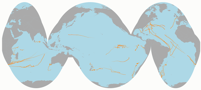
And obviously, there’s no particular reason that Africa should be in the middle of the map. The Americas could be east of Asia instead of West of Europe. The interrupted homolosine projection I came up with to map shipping routes (below) splits Western Europe from the Near East; it would probably put the center moving from Iran due westward into the Pacific. And that’s not even to get into maps that move the equator off the center of the map.
So why are they using a homolosine projection at all? I don’t want to put too much more thought into this than they did. But it must be some combination of them acknowledging the problems with the mercator and/or equirectangular projections, while just wanting to get along with center of population calculations that show the march of population. So they use the first equal-area projection that comes to hand, and assume it’s good enough to show centers of population. Which, honestly, it is; centers of population are such a vaguely-defined thing that there isn’t really any harm in presenting them in whatever light you want.


Comments:
Now I’m looking at this post a year later and …
Ben - Jul 5, 2017
Now I’m looking at this post a year later and thinking “But the earth is the geoid, not a sphere! What if someone came along and pointed that out in the comments? Would I feel stupid?” Which is totally unimportant for the point here, but a sign of how defensive one can get about blogging. (Would geoid vs sphere make any difference for center of population calculations? Probably not.)