Map and Data Visualization Gallery
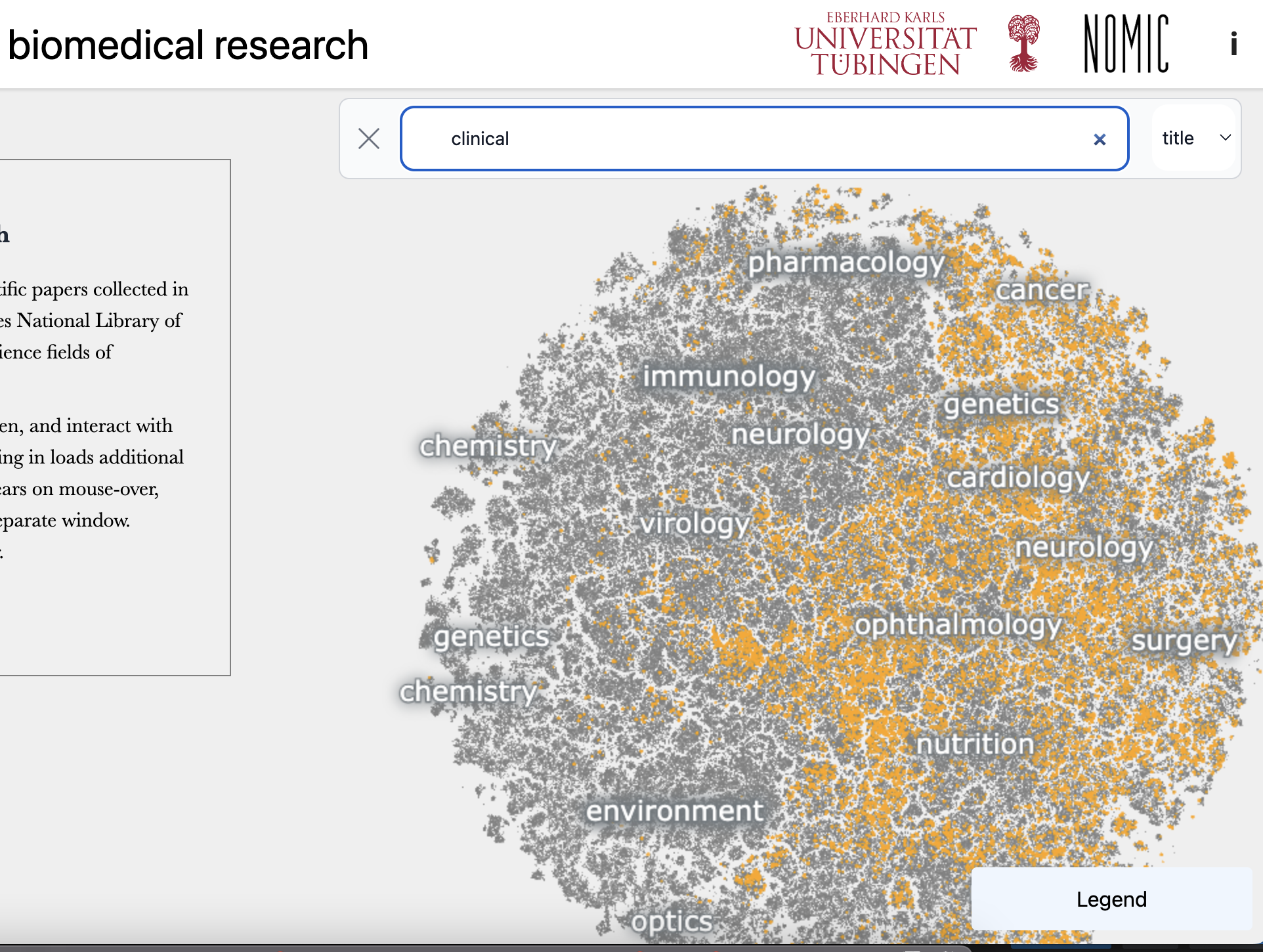
A visualization and narrative description of 21 million biomedical abstracts combining scrolling, search, and interactive zoom. In collaboration with Rita Gonzalez-Marquez, Dmitry Kobak, and others at Berens Lab at the University of Tübingen.
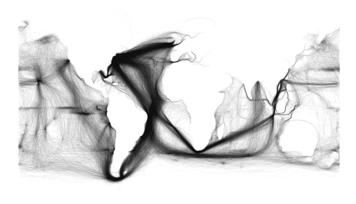
The tracks of vessels from the ICOADS database. I made it to illustrate how rich metadata alone can be as a source for historical research: it’s also just an interesting way to see the continents through large-scale patterns of behavior. Several people asked for higher-resolution versions; I recreated a few dozen charts on the same concept [here](http://flickr.com/photos/10052187@N05)
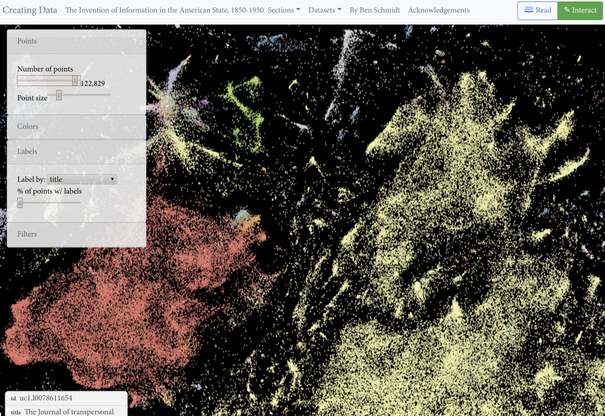
This portion of [*Creating Data*](http://creatingdata.us) presents a new way to look at the digital library: a visual bibliography as a 15-million book zoomable scatterplot, displaying a variety of metadata and allowing you to click through to the Hathi Trust.
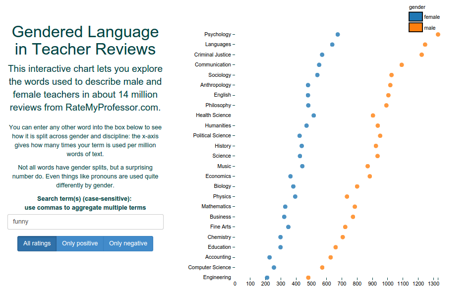
An interactive exploration of the different language used to describe professors in multiple fields. As well as my explanation off the page, the writeups in [The New York Times](https://www.nytimes.com/2015/02/07/upshot/is-the-professor-bossy-or-brilliant-much-depends-on-gender.html) and [The Chronicle of Higher Education](http://chronicle.com/blogs/ticker/how-reviews-on-rate-my-professors-describe-men-and-women-differently/93687) using the D3 interface to Bookworm.
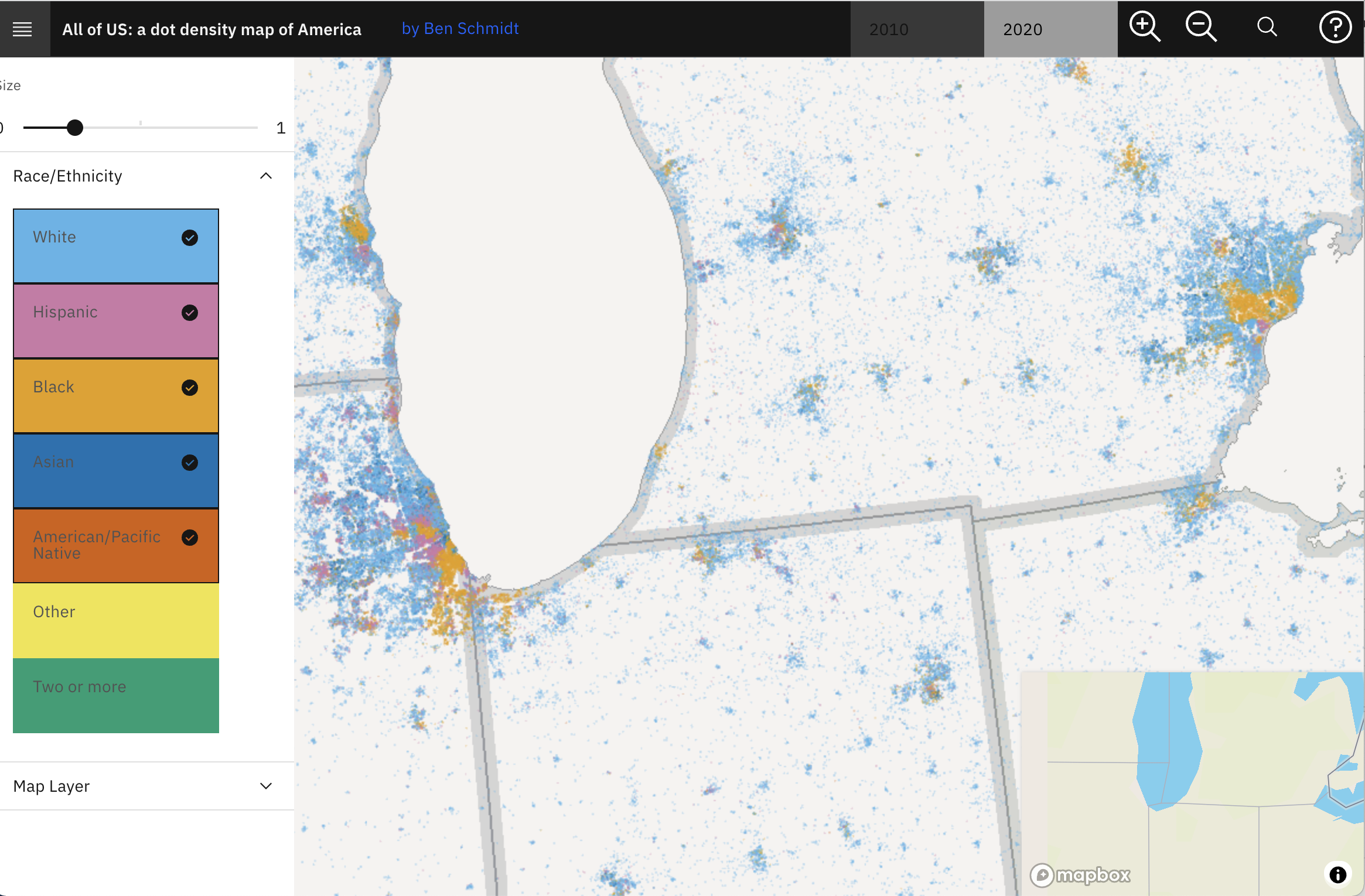
One point per person in the US for the 2010 and 2020 censuses, fully zoomable and interactive using WebGL and [Deepscatter](https://github.com/CreatingData/deepscatter). Since this uses WebGL individual point rendering and quadtiled data, it can be far more responsive than raster-based maps you may have seen in 2010. Plus, if you zoom all the way in in some views it has little person glyphs!

This is less a data visualization than a primitive for making them. If you've never heard of the Hilbert Curve, there's nothing you'll care to see here. But [Job van der Zwan](https://observablehq.com/@jobleonard/a-simple-algorithm-to-generate-h-curves?collection=@jobleonard/space-filling-curves) and [Martin Wattenberg](http://hint.fm/papers/158-wattenberg-final3.pdf) have done interesting things with the under-appreciated H-Curve, and there's a lot more could be done. Plus it's fun to watch the animation.
The hard part of this is Philippe Riviere's extraordinary work creating something called the Voronoi Projection. I noticed, though, that enables what I call 'Data Driven Projections,' map representations of the world customized for any set of points. The one below shows the voyage of the Beagle in the 1830s, with Darwin; you can change the observable notebook at [this link](https://beta.observablehq.com/@bmschmidt/data-driven-projections-darwins-world) for any dataset you like.
Using topic modeling and [my database of 80,000 film and TV captions](http://movies.benschmidt.org/), I look at [the typical plot structures for about 150 common TV shows](http://sappingattention.blogspot.comssss/2014/12/typical-tv-episodes-visualizing-topics.html). (This one is not an interactive, at least not yet: but it was all built entirely in the interactive bookworm browser.)
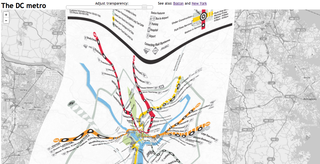
This is a set of transit maps deformed to fit onto the Internet map-tile view of the cities ([Boston](http://benschmidt.org/mbta), [New York](http://benschmidt.org/mta), [Washington](http://benschmidt.org/dcmetro)) they depict; it explores the tension between two different ways of representing the same urban spaces. Made using QGIS, Leaflet, and some command-line GDAL tools with maps and data from the transit authorities and tiles from Open Street Map.
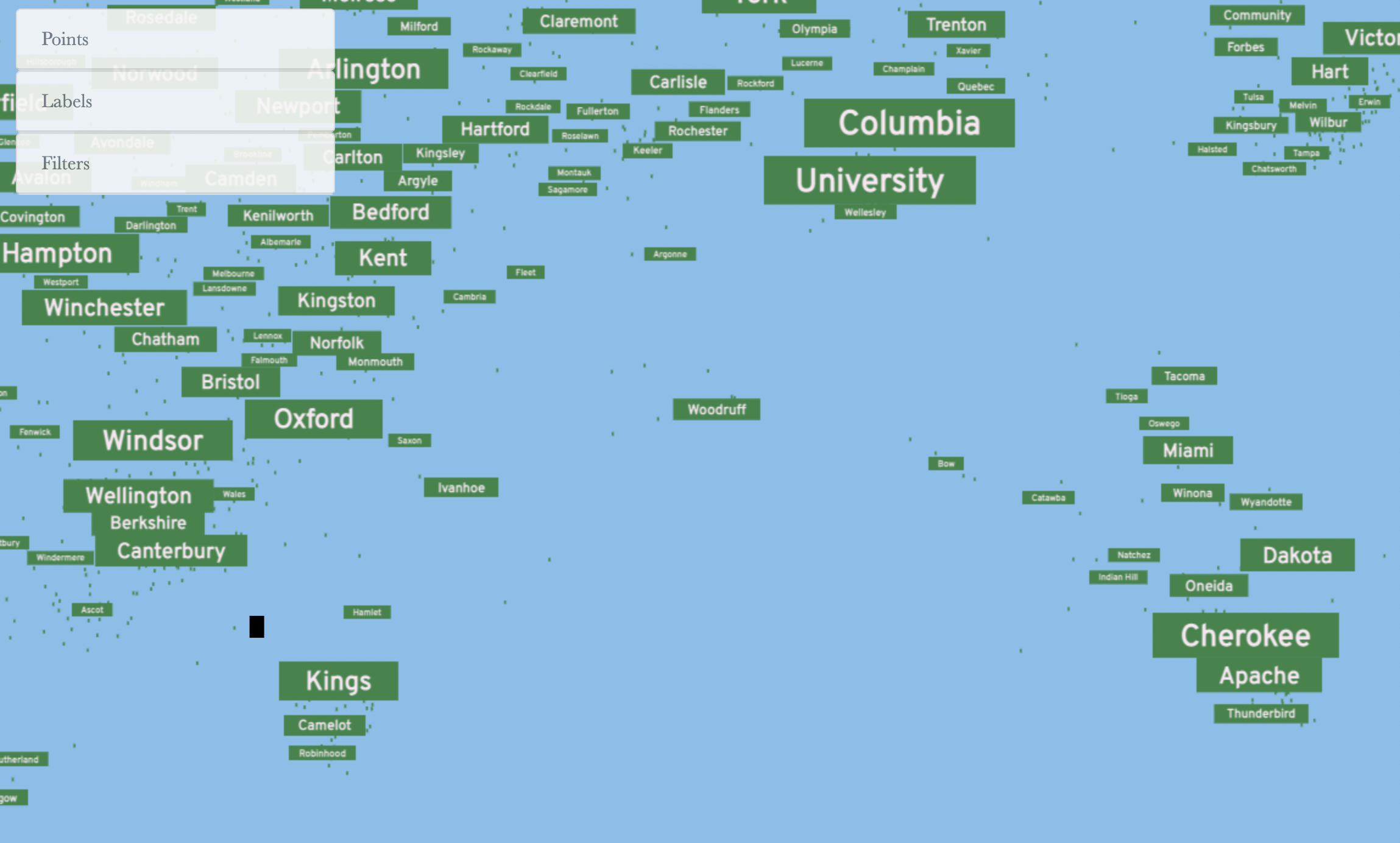
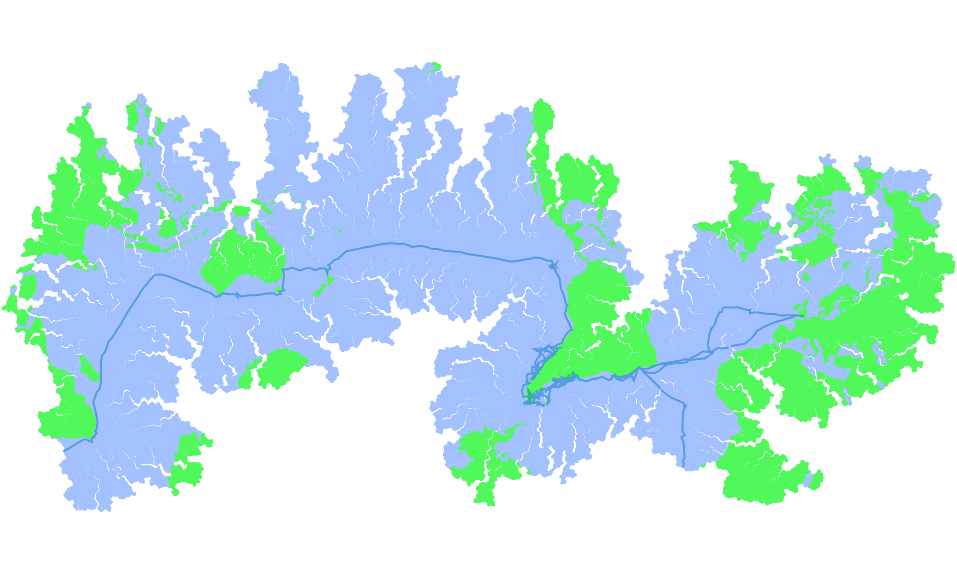
A map of street names in the US clustered together into a field based on what streets tend to occur near to each other in the Censuses Tiger Lines database.