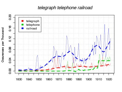
More on Technologies--and, what the graphs show.
I can’t resist making a few more comments on that technologies graph that I laid out. I’m going to add a few thousand more books to the counts overnight, so I won’t make any new charts until tomorrow, but look at this one again.

You remember I claimed that some intellectual movements spread like technologies, and some like news. But that’s only looking at the smoothed curves. As you’ve probably figured out, I plot two sets of data for each word–a thin solid line for the actual data, and a large dotted line for a smoothed version (for the record, a loess smoothing that looks at 15% of the total for each point). What do the peaks mean?
Quite a bit–sometimes. They can be suggestive of where the word _was_ news, at least for the storytelling mind. There are big peaks for railroad right before it starts to grow, for telephone well before it takes off, and for telegraph well after it’s taken off. In some cases, I’m pretty I know what they are–the first big telegraph peak, in 1866, is the laying of the first transatlantic cable. The first telephone peak comes right in the flurry of patents from Bell, Gray, and Edison, although the one five years later is odder. But sometimes they are random. Those up-down squiggles for railroad after 1910, say, or for telephone after 1915, can’t mean very much.
Either way, the loess curve ignores them. I think that’s actual good, for the most part–we want to know about when certain terms hit the news, but we also want to know something about broader penetration into culture, and I think smoothing over years helps do that. There are more mentions of railroads while the transcontinental line was being laid in the late 1860s, and fewer in the earlier 1870s, but maybe that has to do with news, not with broader penetration. Characters in novels keep getting on trains at a higher rate, economists worry about railroads more and more, historians pay more and more attention to railroads in describing the 1830s and 1840s. News forces us to reflect on technologies in spurts, but the adoption can be slow. Everyone talked about telephones an extraordinary amount after they were invented, but there wasn’t anything left to say until the network really came into its own after 1910.
But that early railroad peak is the one that really got me thinking. It’s two years long, not one like most of the other current events peaks, and I can’t find anything in particular to have caused it then. Certainly nothing that can explain why so much in 1848-49 , and then never half that much again until 1860. Maybe sometimes that period of reflection doesn’t have to be caused by events in the news, but can just feed on itself Maybe these initial bursts of discourse outside the broader trend are like the first cranks of an engine when you start up the car, creating the energy for the slower acceleration back up to full volume. Some technologies have them and some don’t.
That’s all a little vague, though–how to take it back to the numbers? Well, it implies that one of the elements in trying to class the different ways a word can increase should include some use of the peaks that aren’t reflected in the smoothing. I’d love to see if anything else has a spike like that one for the railroads, partly just to see if it does mean anything. I’m sure other discoveries get that initial burst like the telephone does–the delay between that and their growth might be immaterial, might not be. In any case, it’s a familiar pattern to historians of technology, but this is a slightly different way of looking at it.
Is there some way to tell what are real peaks, and what are random variations? One thing occurs to me that I’ll try to get set up tonight as well. Currently I’m just counting the times that a word appears–I also should look at the number of books that a word appears in. That would let compare breadth to depth of interest in a subject, which ought to be interesting. If someone just published a two-year magazine about railroads in the late 1840s, that would be one thing; if suddenly 10% of the books published mention railroads where only 1% did previously, something else entirely.
Comments:
Yes! This last idea *is* exciting. I want to use…
Jamie - Nov 2, 2010
Yes! This last idea *is* exciting. I want to use this point to return to the question you raised at the start of this blog about teaching with data analysis–how best to use it?
You suggested that graphic presentation would be a good way to appeal to (or maybe better convince?) students who preferred numbers to anecdotes or narratives. But it seems like this is also an opportunity to present in more compact form the interpretive difficulties and possibilities that historical research involves more generally. The problem of knowing what sources are responsible for word peaks is an efficient way to complicate the issues of source and structure; and the follow-up investigations into genre suggests why the business of “complicating” might be useful or interesting, in addition to being a responsibility.
These are quick impressions, though, and I’d be glad to hear more about the ideas you’ve been developing about teaching with data–not just why it’s good for students, but also why it’s good for their teachers.