A 192-year heatmap of presidential elections with a y axis ordering you have to see to believe
Like everyone else, I’ve been churning over the election results all month. Setting aside the important stuff, understanding election results temporally presents an interesting challenge for visualization.
Geographical realignments are common in American history, but they’re difficult to get an aggregate handle on. You can animate a map, but that makes comparison through time difficult. (One with snappy music is here). You can make a bunch of small multiple maps for every given election, but that makes it quite hard to compare a state to itself across periods. You can make a heatmap, but there’s no ability to look regionally if states are in alphabetical order.
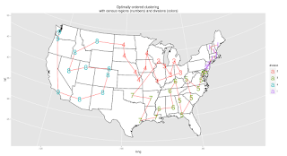
This same problem led me a while ago to try and determine the best linear ordering of US states for data visualizations. I came up with a trick for combining some research on hierarchical and traditional census regions, which yields the following order:
This keeps every census-defined region (large and small) in a block, and groups the states sensibly both within those groups and across them.
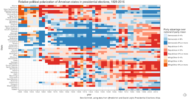
Applied to election results, this allows a visualization that can be read both at the state and regional level (like a map) but also horizontally across time. Here’s what that looks like: if you know something about the candidates in the various elections, it can spark some observations. Mine are after the image. Note that red/blue (or orange/blue) here are not the *absolute* winner, but the relative winner. Although Hillary Clinton won the national popular vote, and she won New Hampshire in 2016, for example, New Hampshire is red because it was more Republican than the nation as a whole.
Click to enlarge
Starting from the most obvious features: the giant blue block in the center is the Democratic “Solid South” from 1856 to 1956. Tennessee and Kentucky are borderline in the old solid South, but active participants in the new bright red solid south of the Republican party. The story of the last 25 years is the expansion of the Democratic mass in the upper quadrant gradually farther south (into VA, NC, maybe even Florida).
The middle band of the map is the old midwest: Wisconsin through Iowa. It shows the least clear long-term alignments, and is remarkable in the 20th century for its incredible moderation. Only four times between 1932 and 2012 did a midwestern state depart from the national margin by more than 9%; Illinois for Obama once, Indiana for GW Bush once, and Minnesota and Iowa once apiece against Reagan. Both Indiana and Missouri broke that pattern this time around; and only Illinois’s moderate democratic lean towards the Clinton kept this year from being the first when the entire region was unified for the same party.
There are also a number of details I’ve never noticed before.
I’ve always admired the strangeness of Carter’s electoral maps in 1976 and 1980, when he carried the Christian vote and not the northern semi-liberals. But Carter’s races were typical in that they helped cement the new alignment of the non-coastal West against the Democrats.
I would have expected the 1912 vertical bar to stick out, because there were two candidates splitting the Republican vote. (Since I’m showing 2-party vote by the top two vote-getters, I only show Teddy Roosevelt’s progressives on the chart above). But the 1916 election is actually the really strange-looking one, in which Wilson seems to somehow activate the old Bryanite western coalition from 1896 to pull out a narrow win.
There are a lot states I think of as pairs (the Carolinas, the Dakotas, Kentucky/Tennessee), and most tend to vote along the same lines. But despite the tiny size and deep demographic similarity of New Hampshire and Vermont, they have managed to maintain strikingly distinct political cultures for decades. I had no idea New Hampshire actually flirted with being Democratic-leaning during the 1920s.
When Grover Cleveland ran in 1892, he had barely lost his re-election bid in 1888 to Benjamin Harrison (winning the popular vote but falling short in the Electoral College). When he came back for a rematch in 1892, the Republicans had installed 6 new states that all voted strongly against him–SD, ND, MT, ID, WY, and WA. If I were a Democrat walking into that situation, I would be angered. For all the fears about congressional-district gerrymandering nowadays, at least we don’t have the perpetual threat of actual new states being fabricated to shore up the current leading coalition.
(The motivation for the map, more than the outcome): I recall in October, people criticized Clinton for campaigning in Georgia and Arizona because they were unnecessary “reaches,” when she should have focused on important swing states. But in fact, Clinton was slightly closer closer to winning in Arizona than in North Carolina, and much (2.8%) closer to winning Georgia than Ohio (the quintessential swing state). (She was closer to winning _Texas _than to winning Iowa, which I don’t think anyone would have predicted ahead of time. I am curious how close some of the simulator sites got to these results.) And for all the incantation of [“Pennsylvania,” “Michigan,” “Wisconsin”] on the left, it’s worth remembering that Florida was just as close as Pennsylvania percentage-wise.
Methodological footnotes:
I use orange for Whigs and other miscellaneous parties (Roosevelt’s Bull Moose progressives in 1912, National Republicans in 1832) because in every election since 1828 there’s some party roughly equivalent to the modern Democrats (blue), and orange and red are discernable enough to tell if you care but not if you don’t.
Data is from Steven Wolf’s spreadsheet of election results from David Leip’s election atlas through 2012, and David Wasserman’s spreadsheet for 2016. I only took their raw counts; it’s my own version of PVI, as deviation from the national 2-party mean. (So for 1912, for instance, this means I threw out all Taft votes, and calculated every state by whether Wilson or TR did better in the head-to-head vote.)
All states are equal sizes, but some states have more population. One interesting elaboration here would be to use a stream graph, so that state ordering would be preserved but California could get bigger as time goes on.

